Application Overview
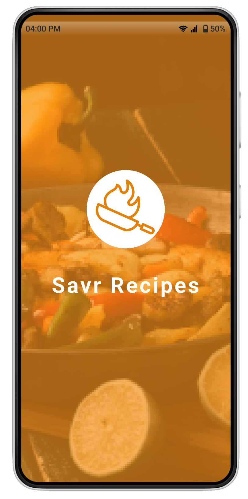
I designed and tested a mobile cooking app Savr Recipes through a modified one-person design sprint. The resources provided included research highlights, a persona, and a short recorded interview with a user.
Project Duration
5 Day Google Venture Sprint
Tools
Figma
Role
UI/UX Designer
The Challenge
Savr needs to help make the process easier for users to accurately, and easily follow the cooking instructions. The users feel as if the app is complicated to navigate once they start the recipe.
The Solution
1. Edit the current app’s recipe to be more interactive with the user
2. Give the user a better experience when cooking their food on the Savr Recipes application
Visuals
SAVR RECIPES
Savr is a new startup that shows hundreds of recipes, and cooking tips for at-home chefs. They have an active community of users who rate and review recipes for other users.
Recently, Savr has seen some negative reviews about recipes that involve too many steps or more advanced techniques.
Many people who were excited about certain recipes end up disappointed with the outcome, because they didn’t feel the instructions were clear, or easy to execute.
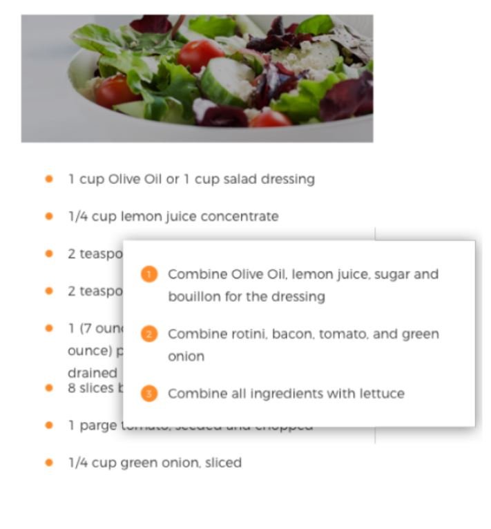
Currently, recipes are written as text, in ordered steps from start to finish
Design Constraints
Your solution should be designed as a feature for the Savr Recipes native mobile app
Users have expressed positive feedback about finding quality recipes
Focus on creating a better experience for users when it’s actually time to cook it!
Persona
DAY 1 - MAP
User Map
On Day 1 I sketched out a few maps to find an end-to end solution that provides a more accurate and easier experience for the user
In my solution I wanted to include a screen where the user could watch a short video of the instructions to make it easier for visual people to follow. In addition, I wanted the ability for the user to prepare for the next step when waiting for the step to be completed.
DAY 2 - SKETCH
I began by looking at 3 different competitors to see how they displayed their recipes and what the process included for a user.
TASTY
KITCHEN NETWORK
JOW
After viewing these apps I had a better idea what my app was going to look like. I wanted to include an accessible ingredients list from tasty, the aesthetic of Food Network and the icons of the ingredients from Jow. All of these elements will make the users experience better by having accurate directions, easily readable ingredients and a simple and accessible application.
Crazy 8’s Exercise
Below are the sketches from the process of the Crazy 8’s Exercise. This exercise helps get all ideas out in the beginning and allows you more freedom when brainstorming.
Crazy 8’s Exercise: You have 8 mins to draw out 8 potential screens, and then you stop and review what you drew
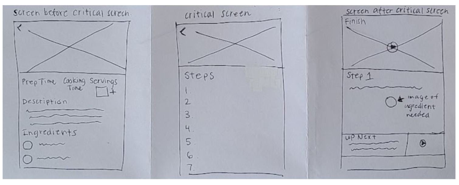
Solution Sketch
I chose the third screen as it seems like the most important screen for the user. The user is going to view this screen with all of the recipes that they choose to make.
With my solution sketch, I drew a panel of 3 sketches to include what the user would do before and after my critical screen.
DAY 3 - DECIDE
I started Day 3 with drawing a storyboard for the Savr application. As I made this storyboard I focused on each step the user would follow when making a recipe. I decided to only have 7 screens to make the process accurate and easy for the user.
DAY 4 - PROTOTYPE
With the storyboard being final, I worked on creating mid-fidelity screens for my prototype to test the usability of my solution. For the visual design I chose to base this off the logo of Savr. I chose a white and warm tone orange color for the elements used.
Hi Fidelity Screens
Prototype
DAY 5 - TESTING
Usability Testing
For the last day I conducted one round of moderated testing with five participants through Zoom. Users shared their screen as they walked through the prompts given to them. These sessions were done with people who cooked at home and enjoyed trying new recipes.
The goal of these tests were to see how accurate and easy the process was to make the recipes with this prototype.
Tasks:
Where would you go to make alfredo sauce?
How would you start this recipe?
Where would you go to start the next step?
After testing with the 5 users here is the good and the no so good about the prototype
The Good
Liked the friendly language
Icons made it more personable
Liked the related recipes
The Bad
Larger font size
needs more categories
Confusing to have recipe show on the main screen
Didn't like the ability to see the next step while working on it
Next Steps
If I were to iterate on this prototype I’d work on the following:
Add an audio feature so the user can follow the recipe hands-free
Add more food options
Have the ability to personalize for each category
Reflections & Takeaways
Altogether, I really enjoyed the entire process of a design sprint. The pace, problem and testing was just perfect. I can truly say that I feel more confident with my sketches and designs by only having 5 days to complete this design sprint. By having this timeframe it’s necessary you move quickly to include everything you want. Normally, I would keep organizing the sketches and moving elements but the time frame stopped this. I will be incorporating the Crazy 8’s exercise in my future projects because of the benefits it implemented in this experience.


